What’s the respiratory-virus “weather” where you are? Updated weekly.
Jan. 27, 2025: While COVID levels continue to decline, flu levels are bouncing back in every region except the West.
For details on what’s happening with each virus. see Dr. Caitlin Rivers’ Jan. 27 Outbreak Outlook.
COVID-19 Current Wastewater Viral Activity Map
US Centers for Disease Control
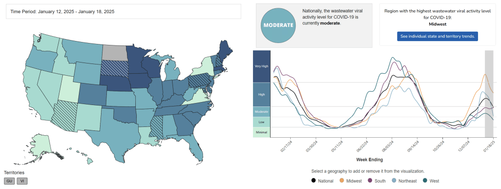
This page shows CDC data on COVID-19 in wastewater with a five- to 12-day delay. For example, when the map is updated on April 14, it shows the data for the week ending April 9. Once you get to the page, you’ll need to scroll down to see the map showing the COVID-19 level in wastewater in each state. Click on “Wastewater COVID-19 National and Regional Trends” near the bottom of the page to see the chart shown here, plus more state-by-state info.
Note: When a surge happens, virus levels in wastewater go up first – before case counts or hospitalizations.
Contact
FluView
US Centers for Disease Control
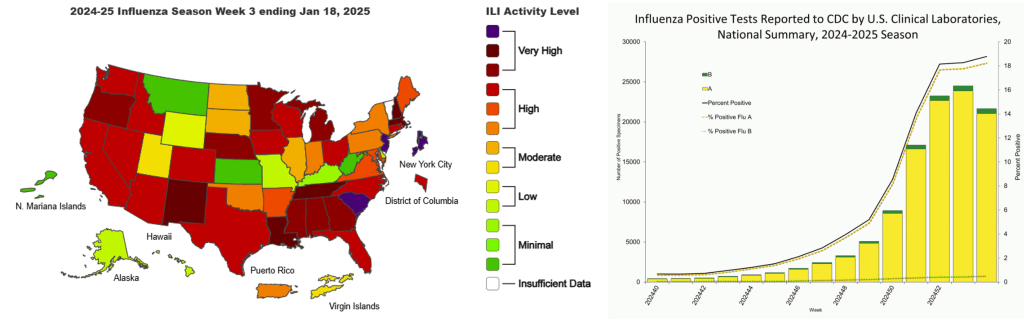
The map on this page is based on how many people see their health care providers because they have a fever plus a cough and/or a sore throat. That group of symptoms is called “influenza-like illness,” or ILI.
The colors on the map tell you how much influenza-like illness has been reported in each state with a one- to two-week delay. For example, when the map is updated on April 14, it shows the data for April 1 – 7.
Note: The levels shown on the map are based on symptoms only, not on test results.
COVID-19, Influenza, and RSV Wastewater Monitoring in the U.S.
Biobot Analytics
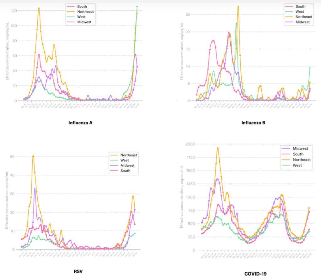
Biobot Analytics is a company that tests wastewater from sewers across the country.
This page shows line graphs that track levels of COVID, flu, and other respiratory viruses in wastewater over time. Each graph shows results for the four regions of the US: The South, the Northeast, the Upper Midwest, and the West.
Wastewater Testing Dashboard
Verily
Verily is a company that tests wastewater from sewers across the country.
On this page, they show line graphs that track the levels of different viruses in wastewater over time. Use the dropdown menu to select the virus you want to see. The four lines in each graph represent regions of the US.
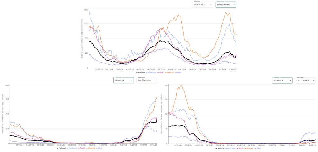
The WastewaterSCAN Dashboard
WastewaterSCAN
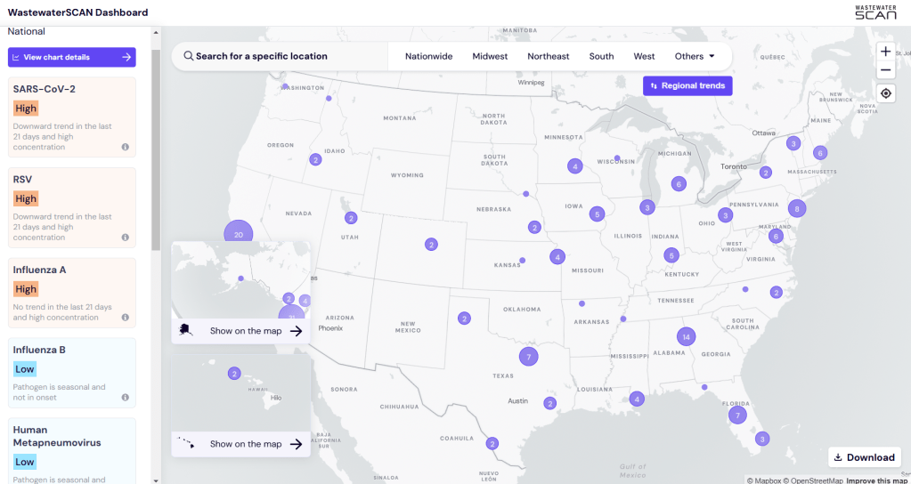
On this page, you can look at wastewater data for lots of different viruses, including COVID-19, flu, respiratory syncytial virus (RSV), and more.
Walgreens Respiratory Index
Walgreens and Aegis Sciences Corporation
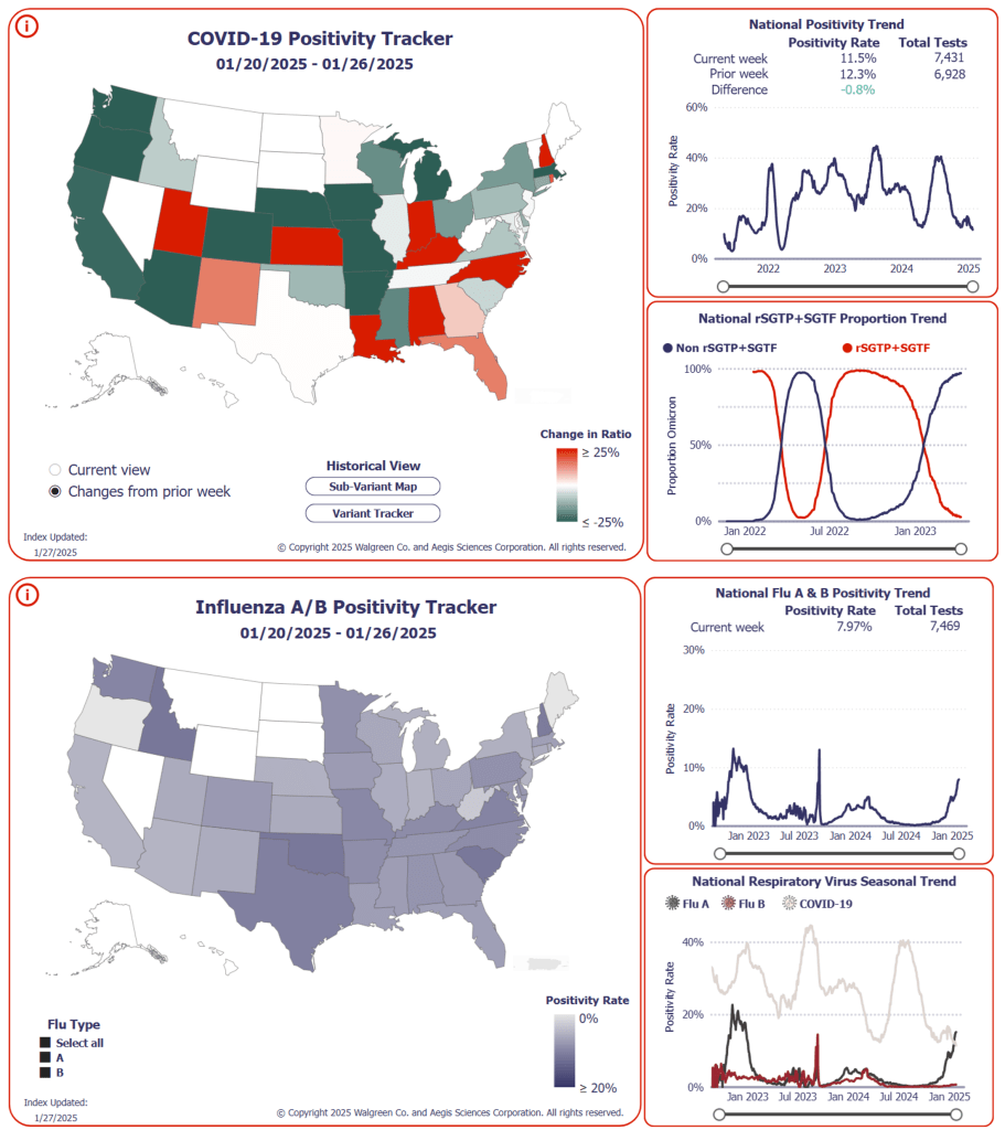
The graph on the top right of each section tells you what percentage of the COVID or flu tests run at Walgreens are positive, nationwide. The higher the line goes, the more people are testing positive.
The two maps work differently from one another. The COVID map tells you, state by state, how the ratio of positive tests to negative tests is changing. The more red a state is, the more the percentage of positive tests is rising. The flu map just tells you, state by state, what percentage of people are testing positive for flu. The darker the state, the more people are testing positive.
Walgreens Flu Index
Walgreens
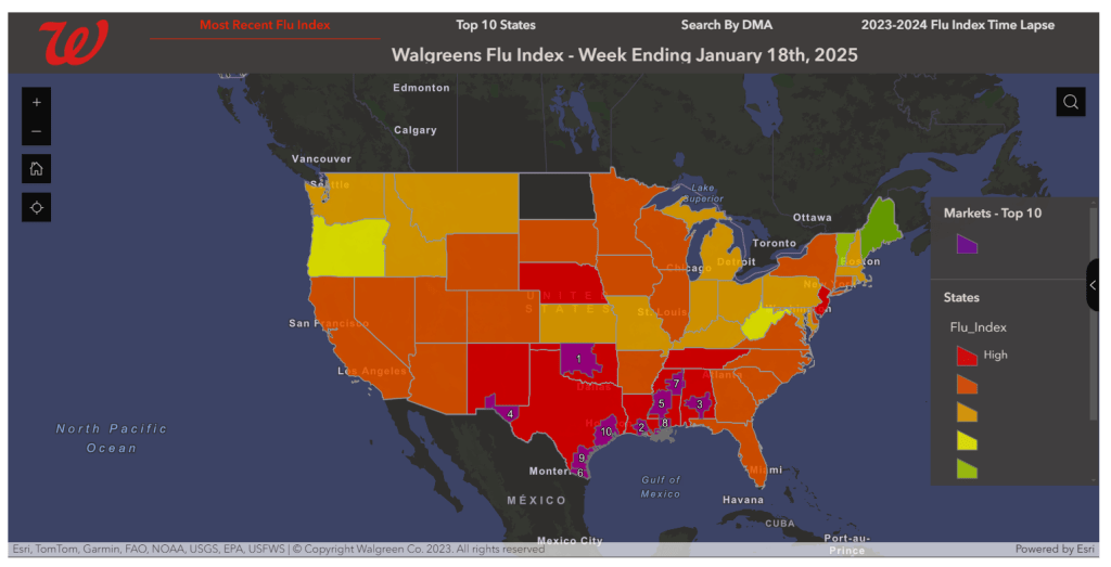
This map is based on prescriptions for antiviral medications that are used to treat flu. The more prescriptions Walgreens pharmacies sell in a particular state, the higher the flu index is there. The purple areas are the markets with the most prescriptions sold over the week in question.
State and Local COVID-19 Wastewater Dashboards
The COVID-19 Data Dispatch
Roughly half of US states have their own dashboards that track COVID wastewater data. A few local and regional public health offices do, too.
Once you get to the site, scroll down a bit to find the list of links.
