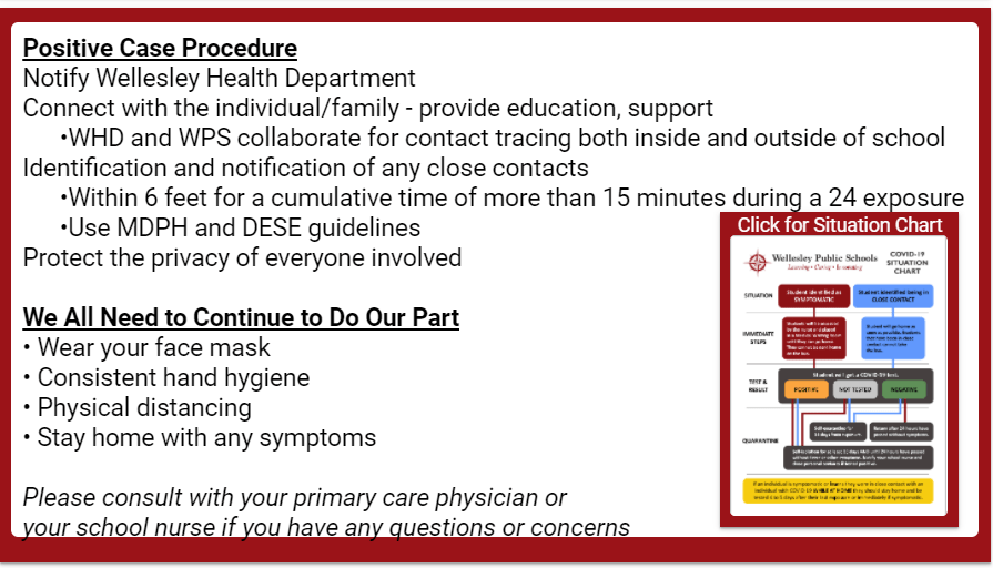
More stuff from the HPS front page here
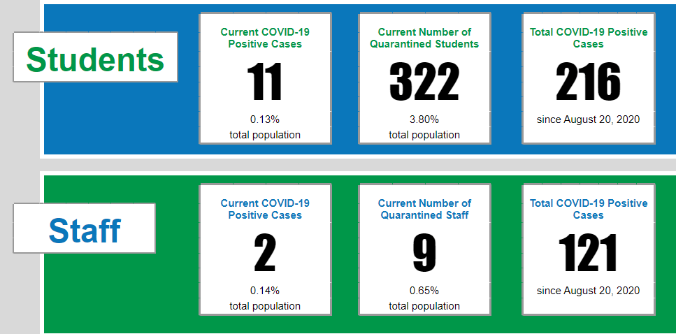
District COVID-19 Statistics
Week of February 8
Remove R column of boxes
Add lines for HES and Bromfield to graphic
Total COVID-19 Positive Cases
Since Start of Screening
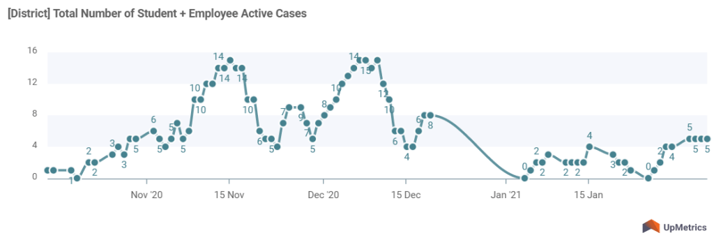
This could be a bar graph if we think it’s more intuitive.
Can also add a similar graph for number of quarantined cases if we think it’s relevant.